R. B. Kitaj
American, 1932-2007
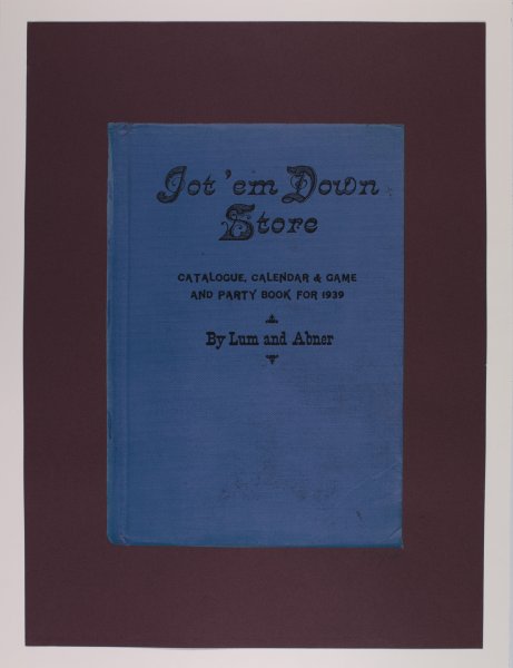
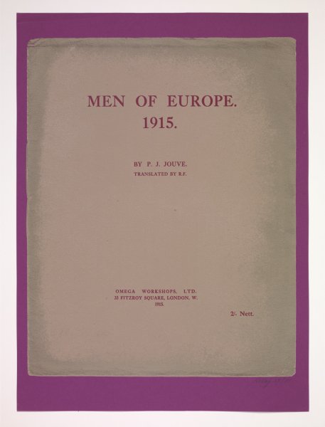
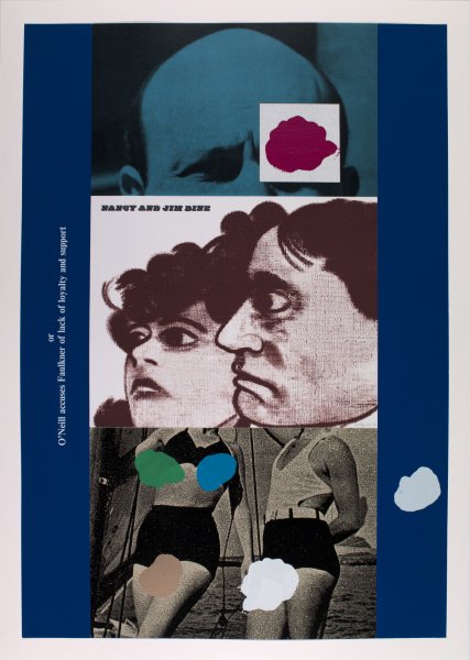
Struggle in the West: The Bombing of London, 1967-1969
Artwork Details
Materials
portfolio of five color screen prints and photoscreenprints, and two color screen prints, photoscreenprints, and collages
Edition:
62/70
Measurements
each (sheet): 40 1/4 x 27 1/4 inches (102.24 x 69.21 cm)
Collection Buffalo AKG Art Museum
Credit
Gift of Gordon Abrams, 1979
Accession ID
P1979:47.1-7
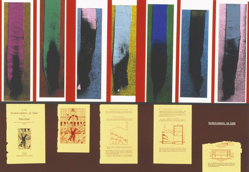
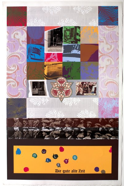
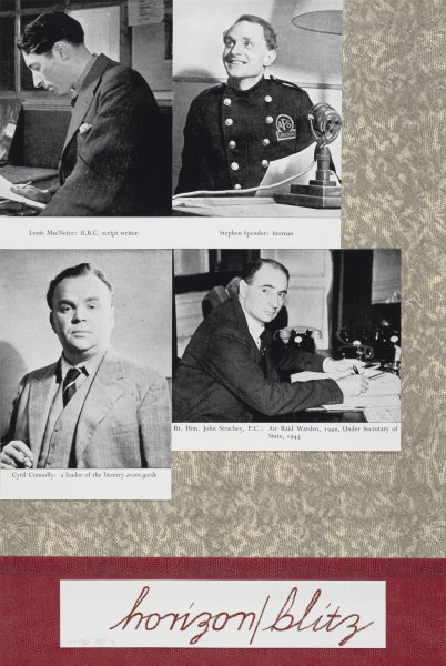
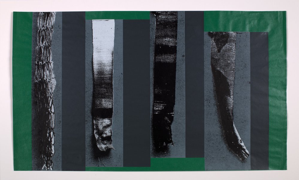
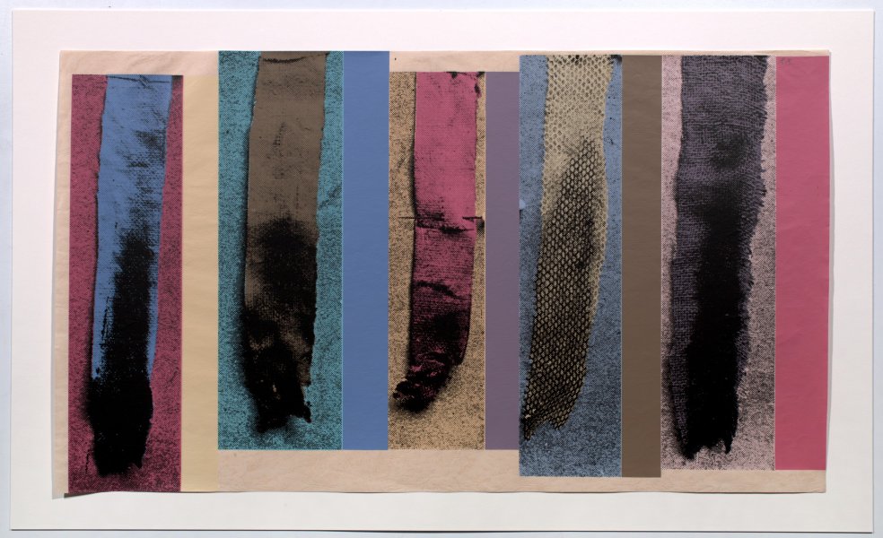
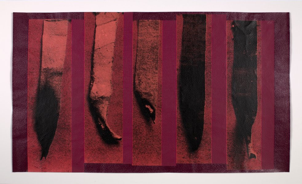
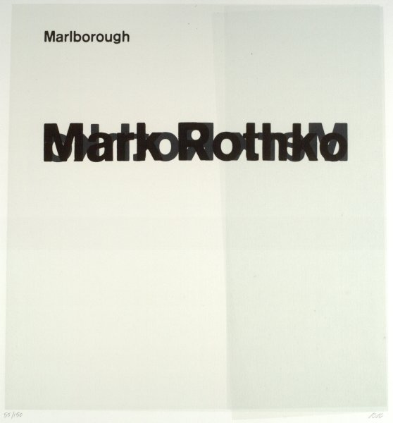
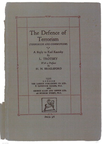
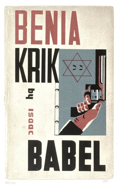
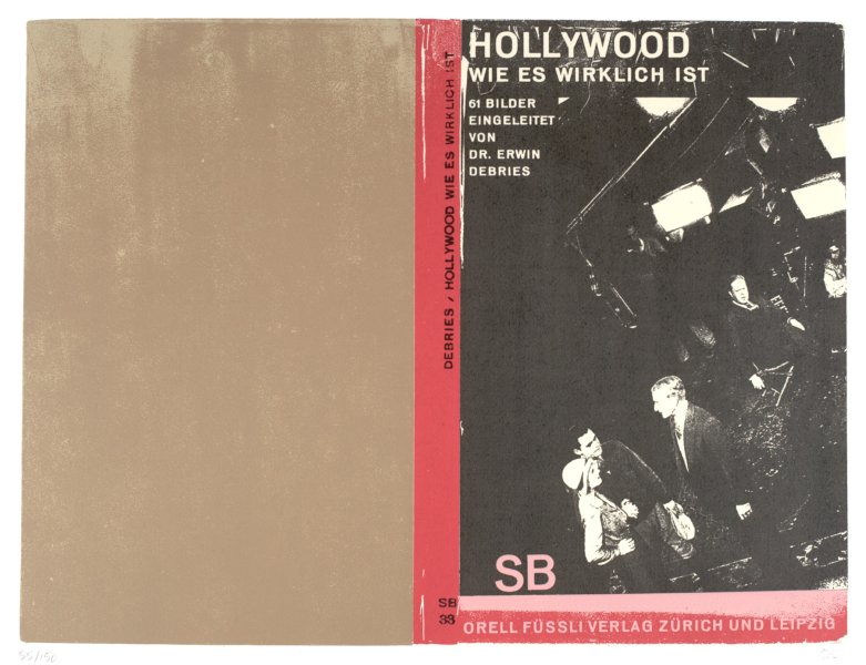
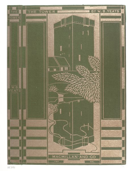
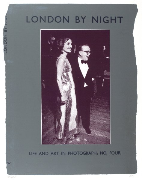
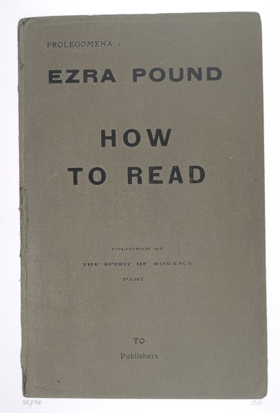
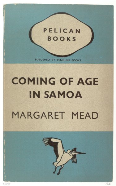
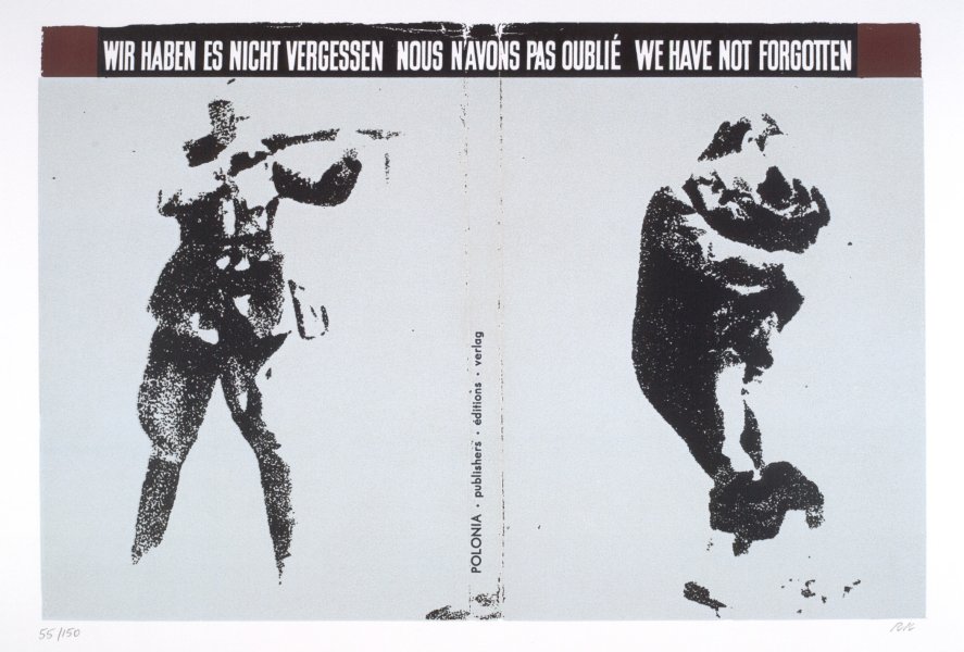
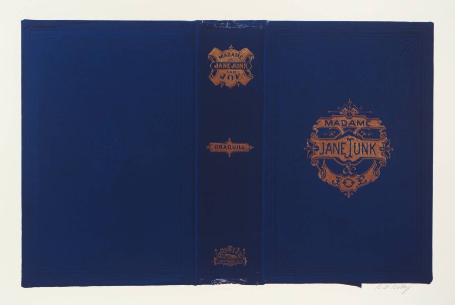
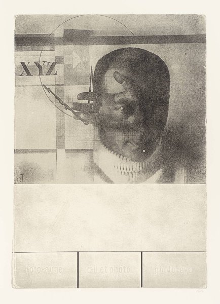
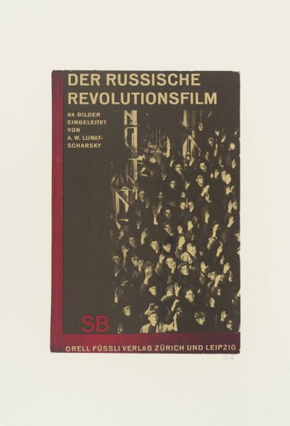
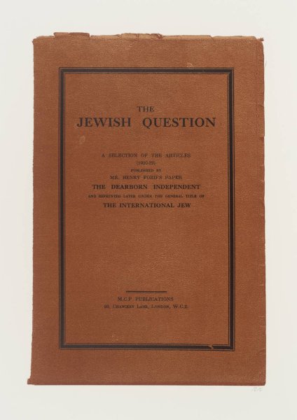
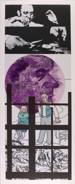
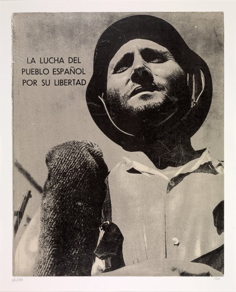
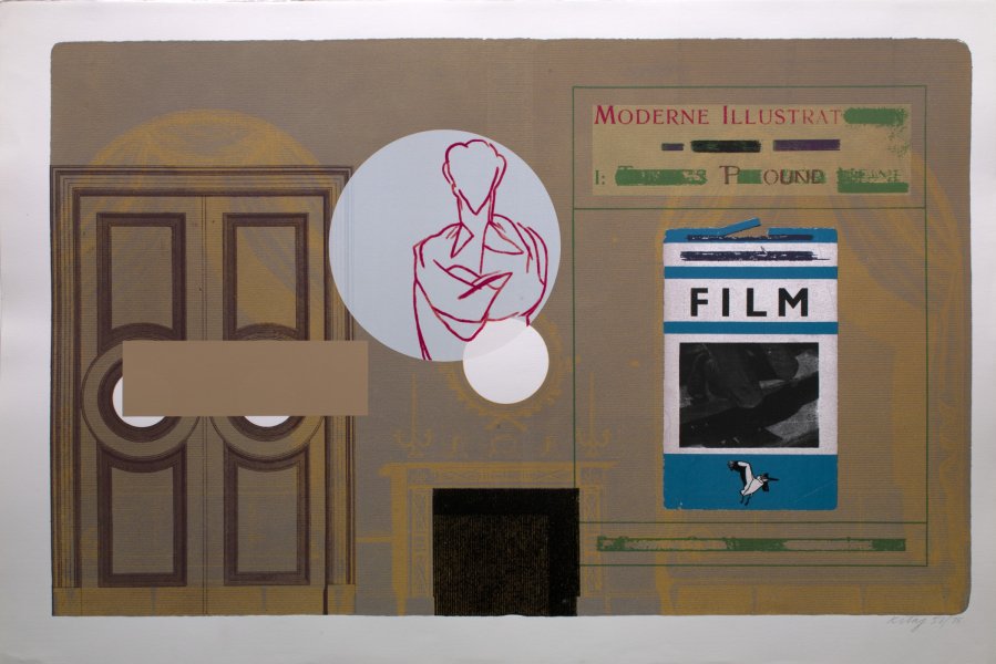
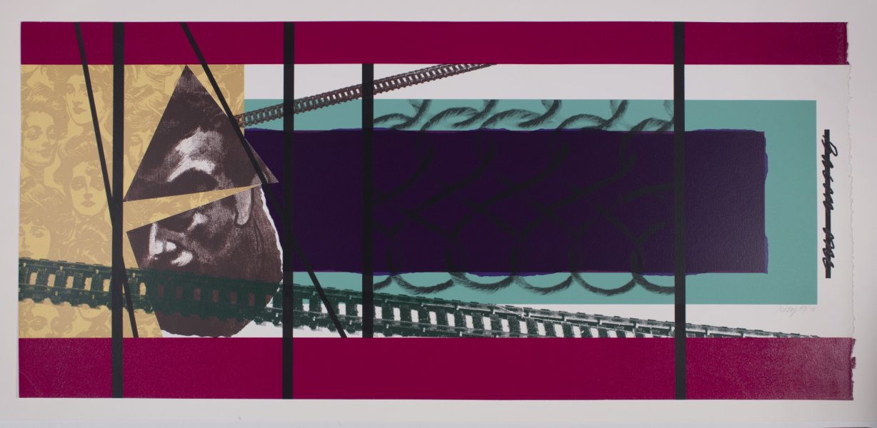
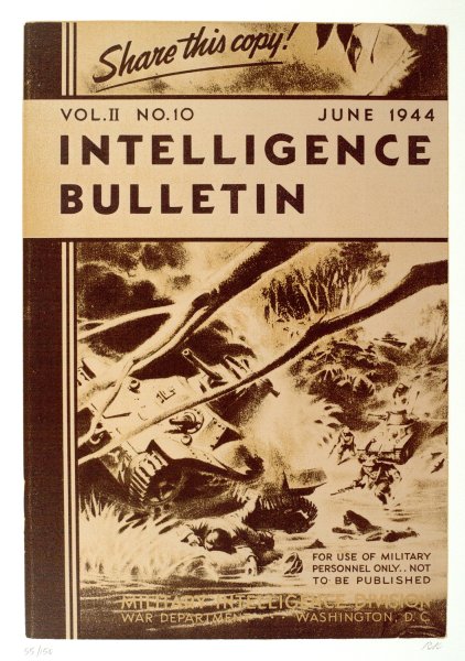
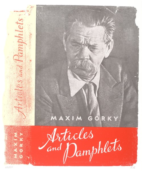
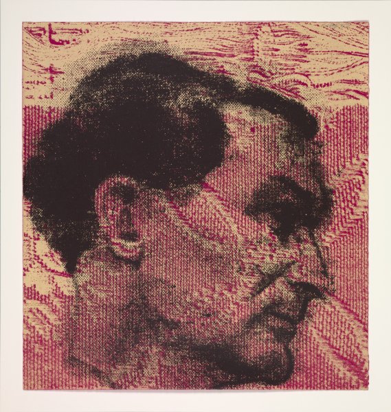
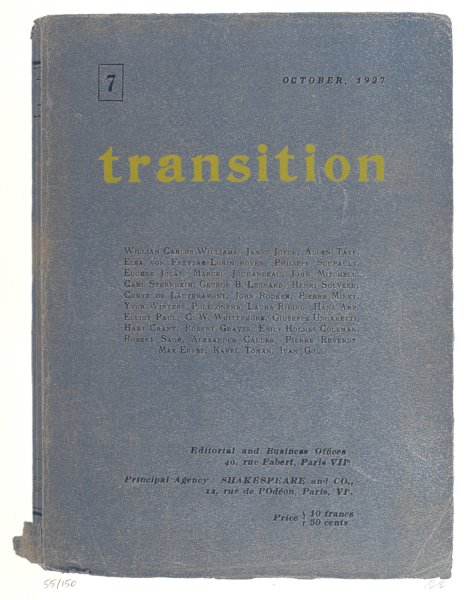
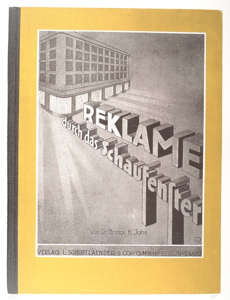
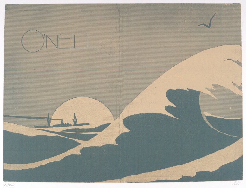
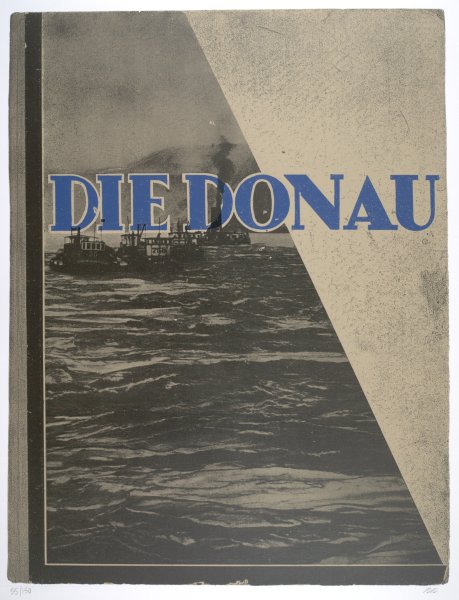
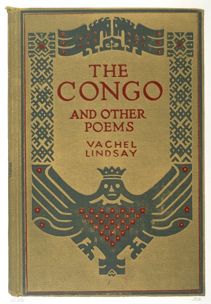
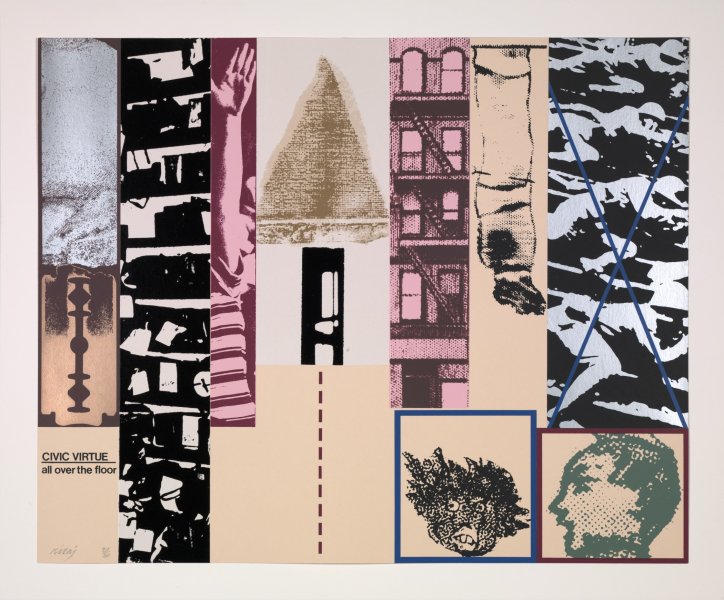
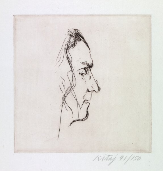
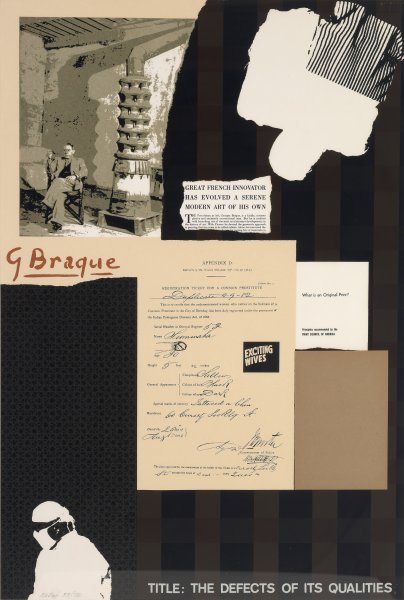
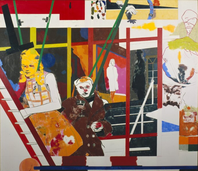
“Struggle in the West: The Bombing of London,” which R. B. Kitaj originally called “Horizon/Blitz,” centers on the City of London during the World War II blitz bombings and the contribution to the war efforts by four literary gentlemen: Cyril Connolly, Louis MacNeice, Stephen Spender, and the Rt. Hon. John Strachey. The suite, which features an amalgam of techniques, from screen printing to collaged photographs, is one of Kitaj’s most colorful groupings of prints. In the process of making Die gute alte Zeit, he instructed the printer to “Go for contrast—use a deep purple and complimentary yellow on one image, a flat orange and khaki green on another, etc. . . . I’ll leave it to you to find strange mixtures and I can correct what I don’t like.”
Label from R. B. Kitaj: Don’t Listen to the Fools, June 21–September 15, 2013
