Materials
- Drawing paper (at least two sheets)
- Scrap paper (for practice)
- Marker (permanent marker, if available)
- Colored pencils
- Scissors
- Glue
- Computer with a drawing program (MS Paint, Paintbrush, etc.) (optional)
Vocabulary
Op art: a type of art that uses optical illusions, which makes it look like a two-dimensional work of art is three-dimensional; often giving the impression that something is moving or sticking out from the wall/paper
Concentric shapes: when two or more of the same shape share the same center point
Value: the relative lightness or darkness of a color
Discussion and Video
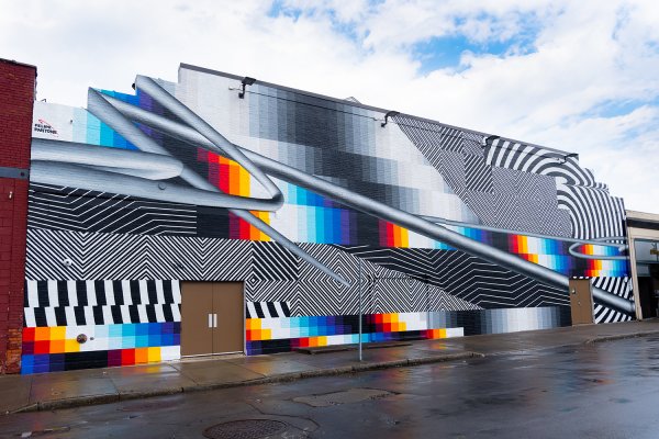
Begin by using the Teaching Tips and Tools for Discussion. An example of how to bring in information about the artist from something your student observed: If they noticed that the diagonal lines through the piece look like pipes, you can share that the artist is inspired by the Op art movement, in which the artists’ goal was to make lines, shapes, and colors on a two-dimensional surface look three-dimensional.
Next, watch the following video:
To begin a discussion with your students, ask the following questions:
- Think about the technology from two years ago—smartphones, computers, video game consoles, social media, etc. How has it changed? Do you agree with Felipe Pantone that it changes fast? Why or why not?
- Pantone is inspired by works of Op art, many of which are in the Albright-Knox’s collection. Take a look at two of these works by Julio Le Parc.
- Let’s compare and contrast. Are there any similarities between those two works by Le Parc and Pantone’s mural Optichromie—BUF? Are there any differences?
Artmaking
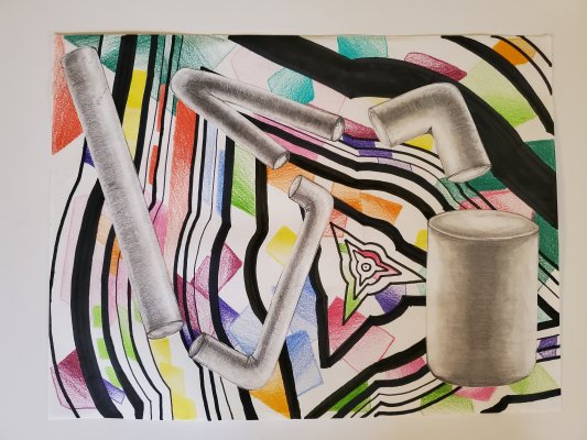
Overview: In this project, students will make a drawing inspired by Felipe Pantone’s mural Optichromie—BUF, 2019. They will explore different ways of creating a work that has aspects of optical illusions and have the option of bringing in a technology component.
- First, show your students how to draw concentric designs. Pantone used diamonds and partial circles in his work, but students can use any geometric shape of their choosing. Next, students should pick a “center point” on their first drawing sheet, draw the first shape small, and then draw the same shape in a concentric design until their page is full. Encourage them to leave space in between the shapes, so that they can play with the thickness of the lines.
- Now demonstrate how to draw cylinder. Explain that they are to use value, specifically with shading, to make it look three-dimensional. Ask them to practice a couple of times on a scrap sheet of paper. Once they have the technique down, they can draw multiple cylinders on their second sheet of paper, playing with length, thickness, etc.
- Next, ask the students to take their colored pencils and add color to one of their sheets (either sheet one with the concentric shapes, or sheet two with the cylinders).
- Once they have added color, ask students to cut out the cylinders and glue them down on top of their first sheet. They can reference Pantone’s mural for inspiration.
Optional:
- To add in a technology element, students can scan (or take a photo) of their work and open it up in a drawing program such as Microsoft Paint. Before they manipulate their work, have them use the zoom function to see how pixelated they can make it look. Ask them to compare their work to the pixelated part of Pantone’s mural. Then let them decide if they want to leave it zoomed in or go back to their original image.
- Next, show your students how they can then use the tools available in the program to add shapes, colors, lines, etc.
- Additionally, you can encourage them to play around with duplicating, mirroring, and rotating their image. They can see what it might look like to try to add in more three-dimensional elements to their design. (This part of the project can introduce quite a few of the tools available to the students and add in a sense of play.)
- If students have access to a printer, they can print out their design. (This step might be best left for when students are back at the school.)

